Choosing exterior paint colors is one of the most impactful, and reversible, upgrades a homeowner can make. It’s also one of the most nerve-wracking. Unlike swapping out throw pillows or repainting a bedroom, an exterior color mistake broadcasts itself to the entire neighborhood for years. But with the right approach, selecting exterior paint doesn’t have to feel like a high-stakes gamble. This guide walks through current trends, timeless palettes, testing strategies, and the practical factors that determine whether a color works or flops on a home’s facade.
Table of Contents
ToggleKey Takeaways
- Exterior paint color significantly impacts home value, energy efficiency, and durability, with lighter hues reducing cooling costs by 10–20°F compared to dark tones in warm climates.
- 2026 trends favor warm, earthy neutrals like greige and soft terracotta, along with sage green and muted blues, moving away from the stark whites and cool grays that dominated previous years.
- Testing home exterior paint colors on multiple sides of your house over 3–5 days in different lighting conditions is essential to avoid costly color mistakes that remain visible for years.
- Classic color schemes like white with dark gray trim, navy with white trim, and sage green with cream trim offer timeless appeal and broad resale value across architectural styles.
- Exterior paint color selection must account for your home’s architecture, roof color, landscaping, and neighborhood context to ensure the final palette looks cohesive and maintains curb appeal.
Why Your Exterior Paint Color Matters More Than You Think
Exterior paint does more than protect siding from UV rays and moisture, it sets the tone for how a property is perceived. Real estate agents consistently note that homes with fresh, well-chosen exterior colors sell faster and often command higher offers. A dated or clashing palette can make even a well-maintained home feel neglected.
Beyond resale value, exterior color affects energy efficiency. Lighter hues reflect more solar heat, reducing cooling loads in warm climates, while darker tones absorb heat, helpful in colder regions but potentially problematic in hot ones. This isn’t just theory: studies show temperature differentials of 10–20°F between dark and light exteriors under direct sun.
There’s also the durability angle. Quality exterior acrylic latex paint typically lasts 7–10 years on wood siding, but lifespan varies by color. Deep reds, blues, and blacks fade faster than earth tones or grays because certain pigments break down more quickly under UV exposure. Choosing a color that holds up well in your climate saves money and labor over time.
Top Trending Exterior Paint Colors for 2026
Paint manufacturers and design publications have zeroed in on several palettes for 2026, and they’re a notable shift from the stark whites and cool grays that dominated the past decade.
Warm, earthy neutrals lead the pack. Think greige (gray-beige hybrids), warm taupes, and soft terracotta. These tones work across architectural styles and pair well with natural materials like stone, brick, and wood trim. They also photograph well, important in a market where most buyers first see a home online.
Sage green and muted olive are gaining serious traction, especially on Craftsman, farmhouse, and mid-century modern homes. These hues nod to biophilic design trends while offering more personality than beige without venturing into boldness that might alienate future buyers.
Deep, moody blues and charcoals continue to trend for homeowners willing to make a statement. Navy, slate blue, and even near-black exteriors create drama, particularly when contrasted with crisp white trim and natural wood accents. But, these require high-quality paint formulations to minimize fading.
Soft whites with warm undertones aren’t going anywhere. They’re classic, versatile, and forgiving with landscaping and hardscape choices. The shift is toward creamy, off-white tones instead of stark, cool whites, think Swiss Coffee or Alabaster rather than Pure White.
Trend forecasts from House Beautiful emphasize layered color schemes that use two or three complementary tones rather than monochrome looks.
How to Choose the Perfect Exterior Paint Color for Your Home
Consider Your Home’s Architectural Style
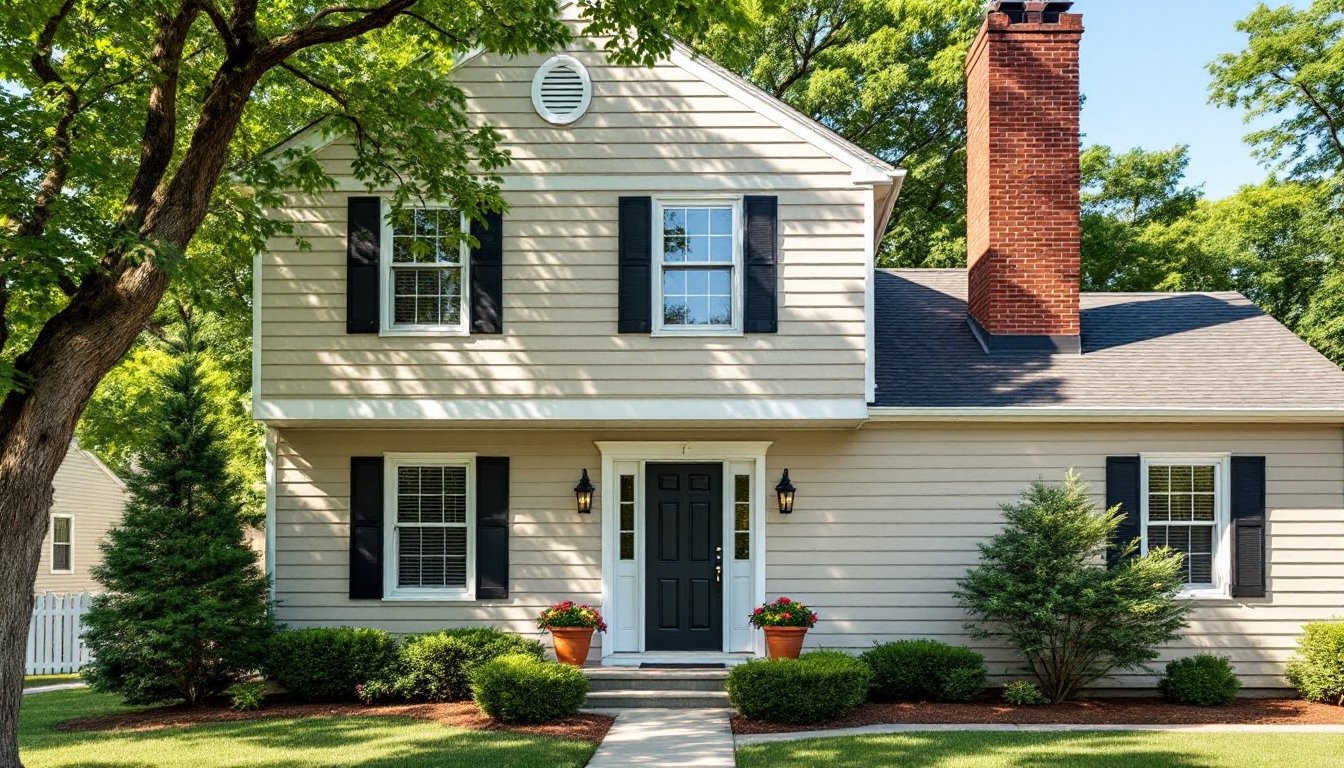
Architectural style isn’t just aesthetic, it provides structural clues about what colors will look cohesive. Colonial and traditional homes typically call for symmetrical color schemes with white or cream trim, shutters in contrasting tones (black, navy, forest green), and body colors in grays, taupes, or muted blues.
Craftsman and bungalow styles were historically painted in earth tones, olive, brown, deep red, mustard, with darker trim to emphasize woodwork and brackets. Straying too far from this palette can make the architecture feel off-balance.
Mid-century modern homes handle bold, saturated colors well, burnt orange, turquoise, sunny yellow, especially when paired with natural wood siding or stone. The clean lines and horizontal emphasis support adventurous palettes.
Victorian and Queen Anne houses are the wild cards. Historically accurate schemes used three or more colors to highlight ornamental details, but many homeowners today opt for simplified two-tone approaches to avoid the “painted lady” look unless they’re fully committed to restoration.
Don’t ignore material constraints. Brick and stone limit color choices to trim, doors, and accents. Stucco handles saturated colors differently than wood siding. Fiber cement siding holds paint longer and more evenly than natural wood, which affects how bold you can go.
Factor in Your Roof, Landscaping, and Neighborhood
The roof is the largest fixed color element and can’t be ignored. Asphalt shingles in gray, brown, or black tones narrow the workable palette. A charcoal roof pairs well with white, gray, blue, or green siding but clashes with warm beiges or yellows. A brown or tan roof supports earth tones, greens, and warm neutrals but fights cool grays.
Landscaping matters more than most people realize. Homes surrounded by mature trees and greenery can handle bolder colors because the foliage provides visual balance. Sparse, desert, or prairie landscapes often look better with colors that echo the natural surroundings, sand, terracotta, sage.
Neighborhood context is part aesthetic, part practical. In historic districts or HOA-governed communities, color choices may require approval. Even without formal restrictions, a neon exterior on a block of muted colonials will stick out, not always in a good way. That doesn’t mean playing it safe is mandatory, but it’s worth a walk around the block before committing to electric lime.
Consider fixed elements like concrete walkways, stone veneers, or brick chimneys. These won’t change, so the paint has to work around them. A red brick chimney limits certain red, orange, or pink siding tones that would clash.
Classic Exterior Color Schemes That Never Go Out of Style
Some palettes have proven staying power for good reason, they’re architecturally versatile, easy to maintain, and broadly appealing.
White body with black or dark gray trim is the safest bet for resale and works on nearly every style from Cape Cod to contemporary. It’s clean, high-contrast, and pairs with any roof color or landscape. The downside: it shows dirt quickly and requires regular washing in dusty or pollen-heavy areas.
Gray body with white trim is the modern neutral. Lighter grays feel soft and approachable: darker charcoals add sophistication. This scheme works particularly well on homes with stone or brick accents.
Beige or taupe with cream trim is the warm-toned equivalent of gray-and-white, timeless, forgiving, and easy to accessorize with shutters, doors, and landscaping. It’s especially strong on traditional and transitional styles.
Navy or deep blue with white trim brings personality without shouting. It’s classic on coastal homes but translates well to suburbs and rural settings. Navy holds up better in sun than lighter blues, which can fade to chalky pastels.
Sage or olive green with cream or tan trim bridges traditional and contemporary aesthetics. It’s grounded, nature-inspired, and less common than grays or beiges, offering subtle distinction without risk.
DIYers exploring classic color combinations often find that two-tone schemes with strong contrast between body and trim deliver the most visual impact.
Tips for Testing Paint Colors Before You Commit
Never, ever, choose an exterior color based solely on a paint chip or digital rendering. Light, texture, and surrounding elements change everything.
Start by ordering sample quarts of your top three to five colors. Most major paint brands sell 8 oz. samples for $3–$6, enough to cover a 2′ × 2′ test area. Apply samples directly to the exterior surface, not poster board, because siding texture and porosity affect how color reads.
Paint test patches on multiple sides of the house. A color that looks perfect on the north-facing front may look washed out or garish on the south- and west-facing sides in full afternoon sun. Observe the samples at different times of day: early morning, midday, late afternoon, and dusk. Colors shift dramatically depending on light angle.
Live with the samples for at least three to five days before deciding. What looks great on day one might feel wrong after repeated viewings. Invite a second opinion from someone with a good eye, overthinking color in isolation leads to decision paralysis.
If possible, test colors when the weather matches typical conditions. A color sampled during overcast November might look completely different in bright June sun.
Use large samples, at least 2′ × 2′. Small dabs don’t give an accurate sense of how the color will read at scale. The larger the test area, the better.
Photograph the samples and view them on your phone or computer. Most buyers and visitors will first see the home online or in passing, so how it photographs matters. Some colors that look great in person read flat or strange in photos.
Don’t skip testing the trim color alongside the body color. The interaction between the two is where schemes succeed or fail. Many budget-friendly home makeovers emphasize the power of thoughtful trim contrast in transforming curb appeal without major structural changes.
Consider the substrate and primer. Previously painted siding may need a tinted primer if shifting from a dark to light color, or the old hue will bleed through. Bare wood, fiber cement, and vinyl each require specific primers for adhesion and durability.